The 1em Rule: Building Resolution-Agnostic Video Designs
May 21, 2026 · By VideoFlowLearn how VideoFlow uses relative em units to create resolution-agnostic video designs that render perfectly from 720p to 4K without changing a line of code.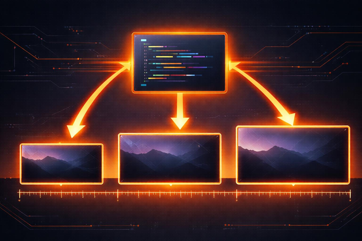
Building video for the modern web usually means dealing with a fragmentation nightmare. You design a lower-third for a 1080p YouTube video, but then you need a 720p version for a legacy player, a 4K version for a high-end display, and a vertical 1080x1920 crop for social media. In traditional pipelines, this often involves complex math, hardcoded pixel values, or re-rendering entire projects from scratch with manually adjusted scales.
VideoFlow solves this at the architectural level with resolution-agnostic video design. By treating video as portable data and using a relative unit system based on em, you can write one piece of code that renders perfectly at any resolution, aspect ratio, or scale.
The Problem with Pixel-Perfect Design
When you hardcode a font size to 48px on a 1080p canvas, that text takes up about 4.4% of the vertical space. Move that same code to a 4K canvas, and your text suddenly looks tiny—shrinking to just 2.2% of the height. Your layout breaks, your margins disappear, and your cinematic look is gone.
Most developers try to solve this by multiplying every value by a scaleFactor, but this makes the VideoFlow builder API harder to read and maintain. VideoFlow takes a different approach by borrowing a concept from CSS: the em unit.
Understanding the 1em Rule
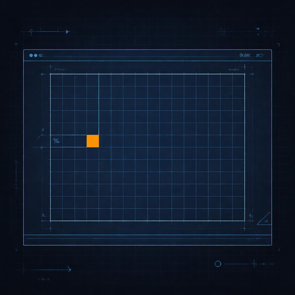
In VideoFlow, the root font-size is automatically set to 1% of the project width. This means that 1em is always equal to 1% of the canvas width, regardless of whether you are rendering a 540p preview or a 4K master.
If you want a title to span half the width of the screen, you set its fontSize to 50. If you want a 2% margin, you use 2em. Because every visual property—from borderRadius to filterBlur—defaults to these relative units, your design scales proportionally by default.
import VideoFlow from '@videoflow/core';

const $ = new VideoFlow({ width: 1920, height: 1080 });

// This title will always take up 8% of the project width
const title = $.addText({
  text: 'Resolution Independent',
  fontSize: 8,
  color: '#FF5A1F',
  position: [0.5, 0.4]
});

// A shape that is exactly 20% wide and 10% high
$.addShape({
  width: 20,
  height: 10,
  fill: '#ffffff',
  position: [0.5, 0.6]
}, { shapeType: 'rectangle' });
Scaling the Cascade
One of the most powerful features of this system is how it handles nesting. Just like in a browser, em units inside a layer are relative to that layer's own fontSize.
If you have a text layer with a fontSize of 10 (10% of the screen) and you add a textStrokeWidth of 0.1em, that stroke will be 0.1% of the screen width. If you later decide to make the text twice as big, the stroke scales with it automatically. This ensures that your typography remains visually consistent even as you animate sizes.

This behavior is particularly useful when building portable VideoJSON documents that need to be rendered across different platforms. Whether you're using the @videoflow/renderer-browser for a quick export or the @videoflow/renderer-server for a batch job, the output remains byte-for-byte identical in terms of proportions.
Beyond Typography: Shapes and Effects
Resolution-agnostic design isn't just for text. VideoFlow's ShapeLayer uses a slightly modified version of the rule to handle aspect ratio changes gracefully. For shapes, 1em is defined as 1% of the shorter axis (min(width, height)).
This means a shape with width: 50 and height: 50 will always render as a perfect square inscribed in the center of the screen, whether the video is 16:9 landscape or 9:16 vertical. This makes building cross-platform social media templates trivial.
Why Your Pipeline Needs This
When you treat videos like code, you shouldn't have to worry about pixels. By embracing resolution-agnostic design, you gain:
- Infinite Scalability: Design once at 720p for speed, render at 4K for production.
- Simplified Layouts: Use normalized
[0..1]coordinates for positioning andemfor sizing. - Cross-Renderer Consistency: The same JSON looks the same in the Playground as it does in your final MP4.
If you're ready to stop fighting with pixel math and start building videos that scale, dive into our Core Concepts guide or check out the VideoFlow GitHub to see the unit system in action.