
Design Once, Render Anywhere: The Developer's Guide to Resolution-Agnostic Video
September 1, 2026 · By VideoFlowLearn how VideoFlow uses normalized coordinates and em-units to create resolution-agnostic video templates that scale from 720p to 4K with byte-for-byte consistency.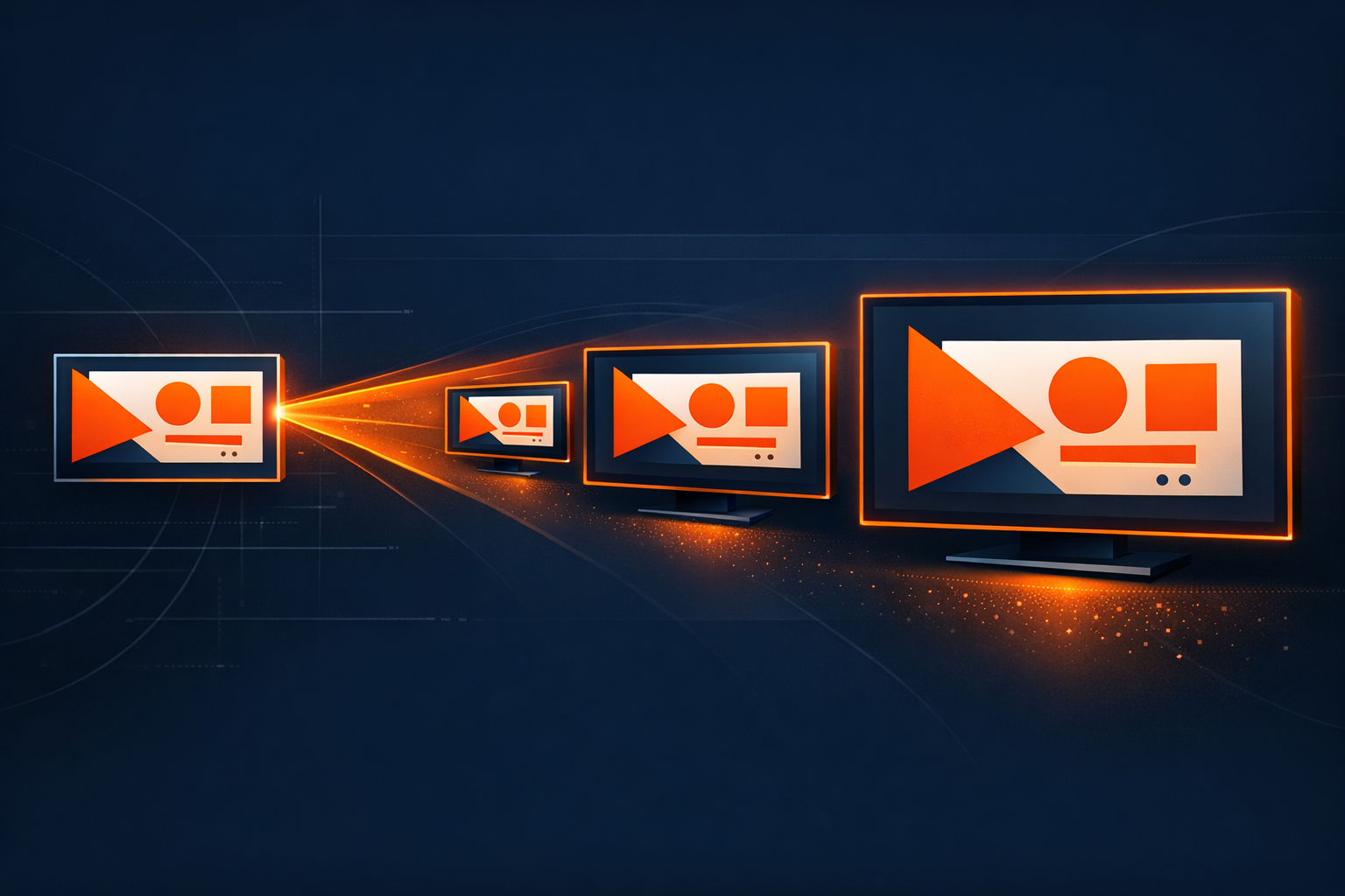
Design Once, Render Anywhere: The Developer's Guide to Resolution-Agnostic Video
Building a video pipeline often feels like chasing a moving target. You design a beautiful layout for a 1080p social post, only to find that scaling it up to 4K for a cinematic trailer or down to 720p for a mobile preview breaks your typography, overlaps your elements, and ruins your margins. Traditional video tools force you into a world of absolute pixels, where every change in resolution requires a manual recalculation of every coordinate and font size.
This is why we built VideoFlow to be fundamentally resolution-agnostic. By moving away from absolute pixel values and embracing a system of normalized coordinates and relative units, VideoFlow allows you to define your video's logic once and render it at any resolution—from a tiny thumbnail to a 4K billboard—with byte-for-byte visual consistency.
The Problem with Pixel-Perfect Design
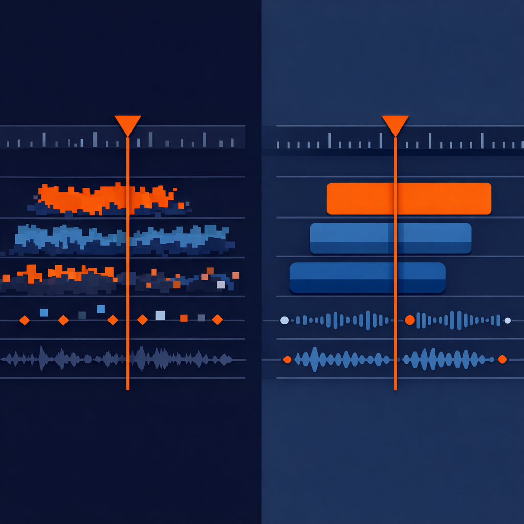
In most video rendering engines, including raw FFmpeg or even many browser-based solutions, you position layers using absolute pixels. If you want a title in the center of a 1920x1080 canvas, you set its x to 960 and y to 540.
But what happens when you need a 4K render? Those coordinates stay at 960 and 540, leaving your title huddled in the top-left quadrant of the screen. You end up writing complex scaling wrappers or, worse, maintaining separate templates for every aspect ratio and resolution. This isn't just a maintenance headache; it's a scalability blocker for any team building automated content factories.
The VideoFlow Solution: Normalized Coordinates
VideoFlow solves the positioning problem by using normalized coordinates (0 to 1) for all layer positions. In the VideoFlow Playground, the center of the screen is always [0.5, 0.5], regardless of whether your project is 1080p or 4K.
const title = $.addText({
  text: 'Resolution Independent',
  position: [0.5, 0.5], // Always dead center
  color: '#FF5A1F',
});
By treating the canvas as a coordinate plane rather than a pixel grid, your layout remains structurally sound as the resolution changes. If a logo is placed at [0.9, 0.1] (top-right corner), it will stay exactly 10% away from the edges whether the video is 400 pixels wide or 4000.
The Magic of the em Unit
Positioning is only half the battle. The real challenge is scaling. How do you ensure that a font size of 48px looks the same on a 720p screen as it does on a 4K screen?
VideoFlow introduces a specialized em unit for video. In our engine, 1em is defined as 1% of the project's width.
This is a departure from CSS em (which is relative to font-size), but it provides a powerful, predictable way to scale visual elements. If you set a fontSize to 5, your text will always occupy 5% of the horizontal width of the video. If you set a shape's width to 20, it will always span exactly one-fifth of the screen.

This system extends to everything: strokeWidth, cornerRadius, filterBlur, and even boxShadow. Because these values are calculated relative to the project dimensions at render-time, your cinematic effects look identical across all outputs.
Building a Resolution-Agnostic Template
Let's look at a concrete example. This script defines a branded lower-third that works perfectly at any resolution.
import VideoFlow from '@videoflow/core';

const $ = new VideoFlow({ width: 1920, height: 1080, fps: 30 });

// A background shape that scales with the screen
const bar = $.addShape(
  {
    width: 40,   // 40% of screen width
    height: 8,   // 8% of screen width
    fill: '#FF5A1F',
    position: [0.25, 0.85], // Bottom-left quadrant
  },
  { shapeType: 'rectangle' }
);

// Text that scales perfectly
const label = $.addText({
  text: 'DEVELOPER GUIDE',
  fontSize: 3, // 3% of screen width
  color: '#fff',
  position: [0.25, 0.85],
});

bar.fadeIn('500ms');
label.fadeIn('600ms');
$.wait('3s');

// This same code can be rendered at 4K by simply changing the constructor:
// const $ = new VideoFlow({ width: 3840, height: 2160, ... });
How VideoFlow Handles This
The core of this magic lives in the @videoflow/core package. When you call $.compile(), VideoFlow produces a portable VideoJSON document. This document doesn't store hardcoded pixel values for these relative units; instead, it stores the unit intent.
When you hand that JSON to one of our three official renderers—whether it's the @videoflow/renderer-browser for client-side export or @videoflow/renderer-server for headless Node.js jobs—the renderer resolves those em and normalized values against the target resolution of that specific render run.
This architecture is what we call The Three-Renderer Rule: you can preview your video in a 60fps DOM environment, edit it in a React-based editor, and export a high-bitrate MP4 on a server, all using the exact same source code without a single layout shift.
Why This Matters for Your Pipeline
If you are building a SaaS product that generates personalized videos, resolution-agnostic design isn't just a 'nice to have'—it's a requirement for cost-efficiency. You can offer users a low-resolution 'fast preview' for free and then trigger a high-resolution 'pro export' on demand, using the exact same VideoJSON.
By treating video as data rather than a fixed-resolution raster image, you unlock the ability to treat your video assets like code: versionable, diffable, and infinitely scalable.
Ready to stop fighting pixels? Head over to the VideoFlow Docs to learn more about our coordinate system, or jump straight into the Playground to see resolution-agnostic design in action. You can also explore the source code on GitHub to see how our unit resolution engine works under the hood.