
Stop Calculating Pixels: Mastering Resolution-Independent Video with VideoFlow
September 1, 2026 · By VideoFlowLearn how to build resolution-independent video layouts using VideoFlow's em units and normalized coordinates. Scale from 720p to 4K with zero code changes.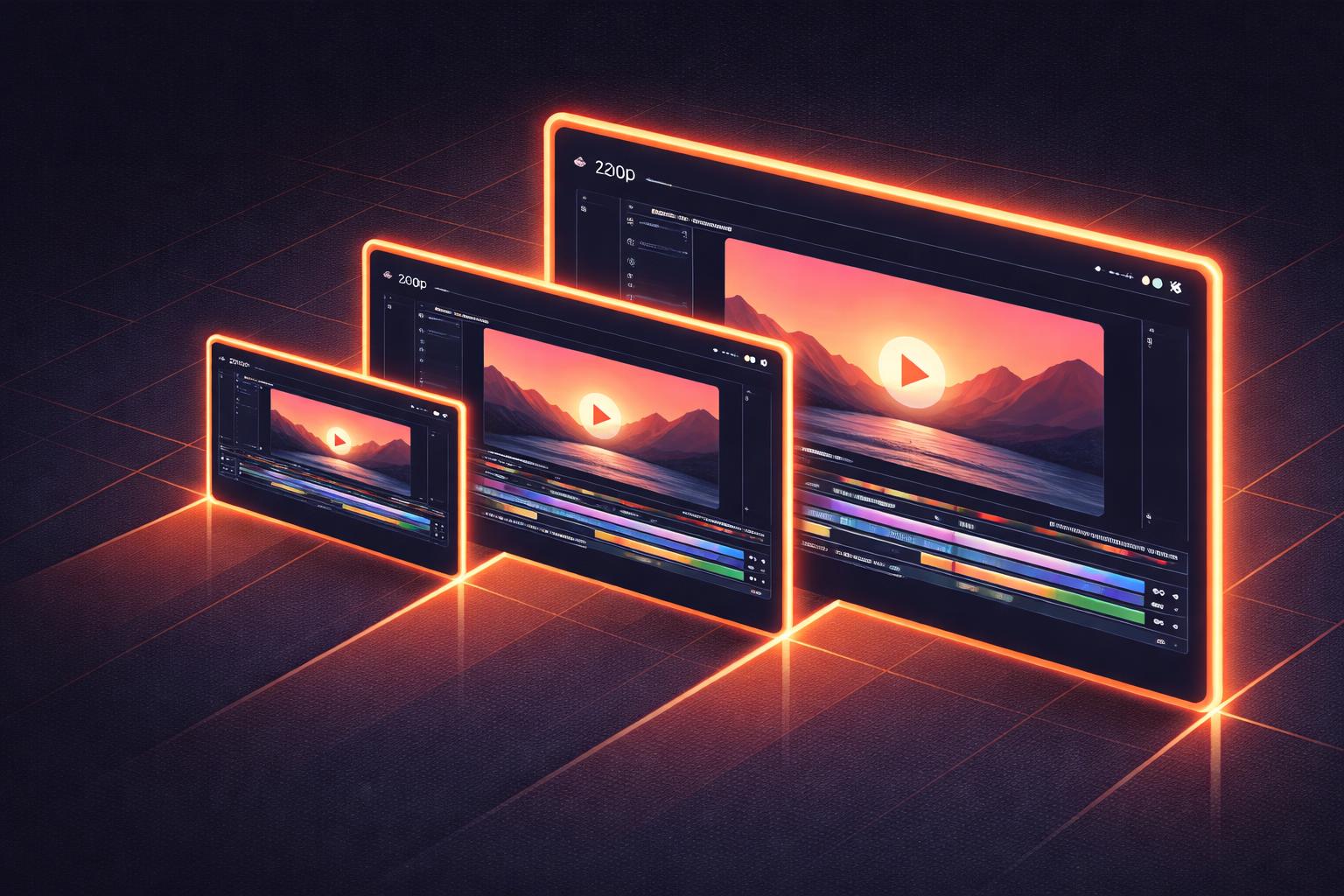
Stop Calculating Pixels: Mastering Resolution-Independent Video with VideoFlow
If you’ve ever built a video pipeline using FFmpeg or a custom canvas-based solution, you’ve likely felt the "pixel-perfect" pain. You design a beautiful lower-third at 1080p, only to realize it looks microscopic when you render a 4K version, or completely overflows when you attempt a vertical 9:16 crop for social media.
Traditional video editing is bound by the pixel. But in the world of programmatic video, hardcoding absolute coordinates is a recipe for maintenance nightmares. If your video is defined as data, it should behave like fluid web content—not a static raster image.
In this guide, we’ll explore how VideoFlow achieves resolution-independent video through its unique layout engine, allowing you to design once and render anywhere.
The Problem with Absolute Pixels
When you tell a renderer to "place text at x: 400, y: 800," you are making a dangerous assumption about the canvas size. On a 1280x720 project, that text is off-screen. On a 1920x1080 project, it’s in the bottom left. On a 3840x2160 project, it’s tiny and floating near the top.
Scaling these videos usually requires complex math on the developer's side—multiplying every coordinate and font size by a scale factor. It’s fragile, hard to read, and prone to rounding errors.
 VideoFlow uses a resolution-agnostic unit system to ensure consistent layouts across all output formats.
The em Unit: 1% of the World
VideoFlow solves this by ditching pixels as the primary unit of measurement. Instead, it uses a relative unit called em.
In VideoFlow, 1em is always equal to 1% of the project width.
This might feel counter-intuitive if you come from CSS, where em is relative to font size. But in video, the project width is the only reliable anchor. By tying everything to a percentage of the width, your layout scales proportionally regardless of the final resolution.
import VideoFlow from '@videoflow/core';

// Whether this is 1080p or 4K, the proportions stay the same.
const $ = new VideoFlow({ width: 1920, height: 1080 });

const title = $.addText({
  text: 'SCALABLE VIDEO',
  fontSize: 8,           // 8% of project width (~153px at 1080p)
  color: '#FF5A1F',
  position: [0.5, 0.4],  // Centered horizontally, 40% from the top
});

const bar = $.addShape(
  {
    width: 40, height: 1, // 40% wide, 1% tall
    fill: '#FF5A1F',
    position: [0.5, 0.5],
  },
  { shapeType: 'rectangle' }
);
In the example above, the fontSize of 8 will always occupy 8% of the width. If you change the project width to 3840, the text will automatically render twice as large in pixels, but it will occupy the exact same visual space relative to the frame.
Normalized Coordinates: 0 to 1
Positioning in VideoFlow follows a similar philosophy. Instead of pixel offsets, the position property accepts a normalized coordinate pair: [x, y], where 0 is the top/left and 1 is the bottom/right.
[0.5, 0.5]is the exact center.[0.1, 0.1]is the top-left corner with a 10% margin.[0.9, 0.9]is the bottom-right corner.
This makes "Responsive Video" a reality. If you need to switch from a landscape (16:9) video to a square (1:1) video for an Instagram post, you don't need to recalculate your center points. [0.5, 0.5] is always the center, no matter the aspect ratio.
One JSON, Infinite Resolutions
Because the VideoFlow Core compiler produces a portable VideoJSON document using these relative units, the rendering stage becomes completely decoupled from the design stage.
You can author your video once in the Playground and then send that same JSON to different renderers for different purposes:
- Preview: Use the
@videoflow/renderer-domto show a low-resolution (e.g., 640x360) live preview in your dashboard. - Draft: Use
@videoflow/renderer-browserto export a 720p MP4 for quick approval. - Master: Use
@videoflow/renderer-serveron a high-powered Node.js instance to render the final 4K master file.
 The same VideoJSON rendered at different aspect ratios and resolutions without changing a single line of layout code.
As we discussed in our guide on the 3-renderer rule, having a unified document format that behaves predictably across environments is the key to scaling video infrastructure.
How VideoFlow Handles the Math
Under the hood, the VideoFlow renderers handle the conversion from em and normalized coordinates to actual pixels at the very last millisecond before drawing to the canvas.
When @videoflow/renderer-server starts a render job, it takes the width and height defined in the project (or overridden in the render options) and creates a coordinate system where 1.0 equals the full span. Every animation, transition, and effect parameter that uses em units is automatically multiplied by the project width.
This even applies to complex effects. If you apply a gaussianBlur with a radius of 0.5em, VideoFlow ensures that the blur looks identical relative to the content, whether you're looking at a thumbnail or a cinema screen.
Conclusion: Stop Hardcoding
The shift from pixel-based design to resolution-independent video is the same shift web developers made when moving from absolute-positioned div tags to flexbox and CSS units. It’s about building systems that are robust, reusable, and ready for any screen.
By mastering em units and normalized coordinates, you can build video templates that truly scale. Whether you are building an automated social media factory or a personalized SaaS recap tool, VideoFlow gives you the primitives to stay fluid.
Ready to stop calculating pixels?
- Experiment with scalable layouts in the Playground.
- Dive into the Layout & Units Guide.
- Check out the source on GitHub.